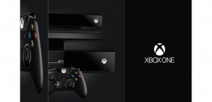
Xbox One and PS4 box designs - head to head
E3 week is nearly over and there's a ton of news to check out on the site right now, including everything you could wish to know about the Xbox One and PlayStation 4.
However one integral question remains on everybody's lips: Which console has the better box design?
Until now that issue has been an impossible one to answer, but now Sony and Microsoft have released images of the box designs that both consoles will come packaged in, and we decided to study them in full detail.
We have to say, they both look pretty good.

Microsoft went first, showing off an all-black design that will have players drooling come the end of the year. We love the minimalist style, with the console, Kinect and controller being visible from a side-on view to really show off the aesthetic beauty of the product.
The only words are simply Xbox One, possibly a statement of intent from Microsoft, who believe they don't need to tell you what's inside the box, you just need to own it.
DRM and always-online features don't seem to be detailed on the box, but maybe Microsoft will include a handy manual inside it.
Moving onto Sony's offering and we can see it looks very much like a traditional PlayStation box, with all the elegant design patterns included.

A lovely shade of blue fades into a white and the full PS4 console and controller are displayed in all their glory for fans to marvel at.
The Sony logo has been slyly placed at the top left of the box, while they also managed to sneak in the fact that it's '500GB' and 'Black', just in case colour blind gamers couldn't tell by looking at the picture.
Truth be told both boxes are simply stunning. The platform holders have come out swinging with their box designs, which both represent the future of next-generation gaming and society's struggle at adapting to the issue of global warming. We couldn't possibly pick a winner.
Apart from Xbox One. Xbox One has the better box.


